Thoughts & Articles
Web Design: Why Simple is So Complex


“I just want a simple design. Minimal, nothing fancy. Something that will grab the visitor, but with a clean look. Minimal text, because people don't read – lots of photos and video, but keep it simple.”
We often hear this request from prospective clients, and it makes sense to us. We are inundated with lots of new information all the time, and when we arrive at a site that feels simple and minimal, it is like a breath of fresh air.
So let's start with something truely minimal and simple.
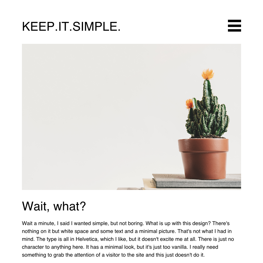
When we start to design a site that is super minimal, we find that it lacks character. More importantly, it lacks branding. The most minimal site conveys the basic information that is on the page but it tends to fall flat. What is necessary is to not only provide a sense of spaciousness and clarity but also to the culture and uniqueness of your brand identity.
Your brand is not just your logo. The logo is part of the brand identity, and perhaps it is the supreme distillation of that identity, but it is not the whole thing. Your brand is a visual representation of your company or project’s total narrative. So, let's see that same simple design with a logo and see what happens.
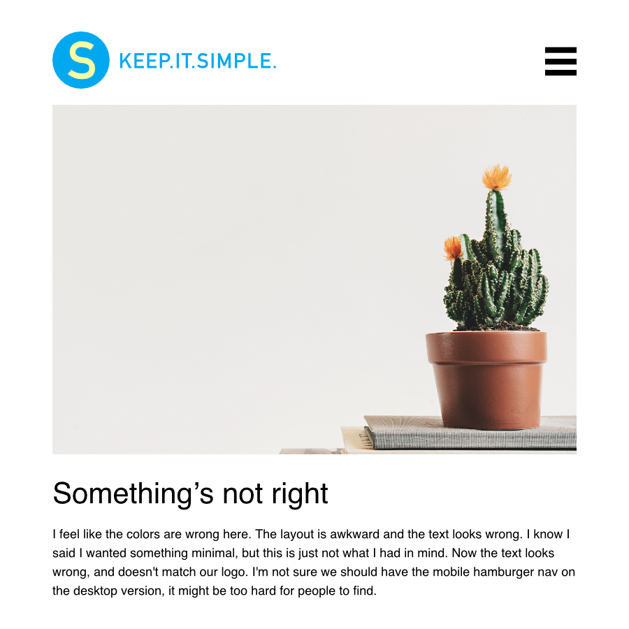
So, now that we see the site in relation to the existing branding, we find that the overall look doesn't quite live in harmony with it. More than anything else, your website needs to be an eloquent expression of your brand, so we need to make sure the typeface and color scheme agrees with it.
Also, although the hamburger nav is, indeed a very simple way to show the site's navigation, it can often be too confusing, requiring the visitor to memorize what was in it the last time they clicked it and keeping the visitor from browsing around when they are on their desktop. On mobile, it is a necessary evil (if, it is at all evil) because of the limited real estate of phones, but on the desktop, you may want to provide a visual reminder of which section you are in and provide clues to where the visitor might click to find out more, without a click.
So, the next step in this fictional design process, we will choose new graphic imagery to fit better with the brand, and change the typeface for the header and the text. We will also open up the navigation so that visitors can get around better. This is not, in any sense the final step in the creation of our minimal design for this process, but will get us a little closer.
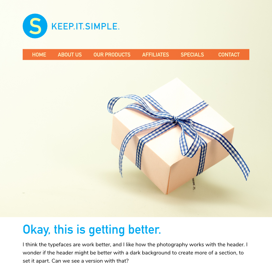
So, leaving the design there, for now, we might expect the client to argue for a header that is less tall, perhaps using only their logo mark, or having the tall header minimize when you scroll down. The overall look so far maintains the simplicity of design but incorporates some of the key elements of the brand.
Creating a simple, minimal design requires balancing many elements:
- Whitespace balancing in multiple browser sizes
- Harmonizing with the brand
- Typeface style and weight choices
- Placement of elements
- Ability to grow the content without making the structure of the site too confusing.
There are also SEO concerns to consider.
- Word count should be high. (Google likes pages with 1000 words!)
- Titles should be to the point and align with key search terms targeted by the company.
- Content should not be overly optimized for SEO (Google can tell when you are kissing up too much)
- Images should have good alt-tags and image names.
- Subsections should have clear, hierarchical sub navigation for content clarity.
When you think of consumer products that feel simple, reflect on the amount of work it took to get it to feel that way. Often these items feel simple because they are intuitive and pleasing to use, not because their design process was quick or easy.
So the path to a simple website is a complex one. The bad news is that simple is never simple. The good news is that a great designer can help you by creating a website that feels simple, minimal and unique. That’s our passion.