
Your website is a living organism.
Slab is an aesthetic tool. It was born out of an artist’s effort, and its potential, it was first realized by creative people just like you. The story starts in 1997. Jim Infantino; the founder of Slabmedia, was working on a website for his band. As a graphic designer, he had a sense of aesthetics. As a musician, he has a vision for what his audience would want from a band’s site. Jim wanted to bring the concept of a dynamic web presence into the more»
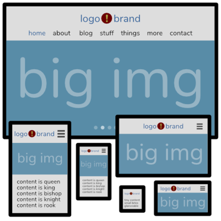
Professional Custom Web Design & Development
The pages you put online - they aren’t just a business necessity. They’re not just points of commerce or an advertisement. They are a key element of your brand. It’s part of your identity, and it’s what you want to say to the world. Your site should look just the way you want it to, and it should be wholly yours, not based on something available to everyone else. It is unique. It is particular. It is professionally designed. It can’t come more»
SEO and conversion for brand marketing strategy.
Organic SEO is important. Being on the first page of google for search terms your audience will use to find you is important. Leveraging directories and location searches are important to being found, but what happens once your site is found? You need to be able to tell a compelling and clear story, combined with style and structure to turn those hard earned searches into results. Your key goal may be a signup, it may be a sale, it may be a contact, or something else, but without more»

How did we choose our name?
I wish it was an easy answer. In the early part of the last century there was a revolutionary philosopher named Ludwig Wittgenstein. One of his major assertions (if you can call them that, which you cannot) was that language is a game. Our words do not have specific, direct referential meaning, rather they are like pieces in a game. We try them out, we communicate because the pieces as they are used have effects, which are themselves, pieces in the same game. Words are defined more»
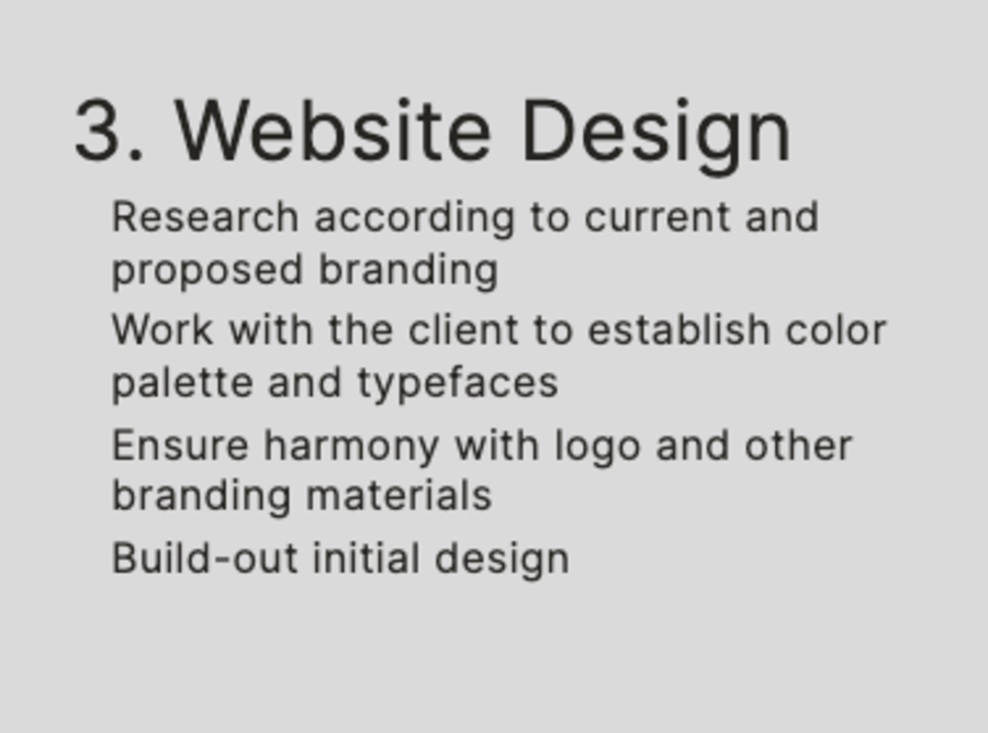
The complex path to creating a website that feels simple.
Creating a custom-designed website that feels light and simple but delivers robust content is a complex process. We believe in doing things right here at Slabmedia. Here are the 12 steps we take to ensure your website comes out looking and working great. Website ProposalResearch the client's brand and competitorsPropose an information architectureExplain content management with systemEstablish site mission and action goalsWebsite Structure PlanCreate simple and intuitive navigation plansOrganize website information into pages and sub-pagesEstablish key elementsAlign architecture with the mission and action goalsWebsite DesignResearch according to current more»
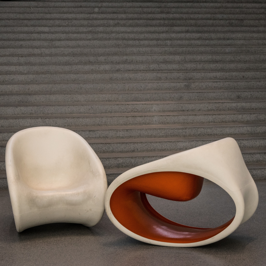
Less is best
Like any great work of art, or piece of music, or great architecture, or city planning, any element that is not absolutely required should be removed. This is most important when it comes to code, as well as design. Unnecessary code slows your site down. Unnecessary design elements draw the eye away from what is essential. We help remove the distractions from your site so that the visitor can focus on your message, your culture, and your brand. When they can find what they want, more»
Harmonize all elements with your brand.
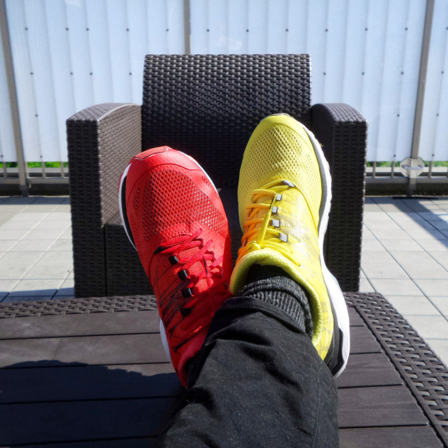
Your brand is not just your logo. It is the feeling you want a potential customer, client, fan or buyer to have about you. It is your public persona. It communicates a mood, a culture, a mission, a world view. The design of your site should always be in harmony with your brand and never forced to fit within a narrow set of parameters from a generic idea of "good design. " That is why your brand and your website need to be unique. more»

Eliminate the aggravators
Aggravators are elements in your site that tend to annoy the visitor. Aggravators increase your bounce rate. Aggravators can be form elements that are not intuitive, navigations that hinder the natural flow of information, push elements that delay movement, or something that just slightly grates on the visitor. These aggravators can seem like slight impediments, but they add up. People like things fast and friction-free online. We work to make sure your site stays that way. more»

Gimmicks get old fast.
We've all seen trendy bits of animation come and go. The reason they show up is that they look cool, and make you feel like something is happening. The first time you see them, they entertain and look modern, the fourth time you see them they become annoying. We happily employ animation or new techniques wherever it helps achieve the desired result for your site, but recommend against them if they have the potential to aggravate, or if they are not essential to your message. more»

Break the right rules.
Not all rules are worth breaking, just for the sake of being innovative. Just as you might want to redesign a door handle to be creative, the first time you see someone show up, try to enter and leave because they can't figure out how to use it, you know the cost of that innovation. Working within proper standards, rules can be broken without risking losing the right visitors. This is why you need a company with years of experience in the design of such tools to more»
Spend less time on your website
Slab is our own web publishing platform that removes stress from editing and making changes to your custom designed website. Unlike other platforms, we do not start with a pre-designed template, so your site will always look as unique as your brand. We custom code functionality, without relying on plugins, so your site keeps working, even if you upgrade to a new version of the Slab platform. With Slab, you don't need to spend your time in a dull admin area. Login to your site, and edit more»