Thoughts & Articles
of Restaurants & Websites

Many of us have had the same experience: we are out and about, and trying to get some information about a place to dine. We visit a restaurant site on our smart phone only to find that
- It is in flash, and as such, invisible
- The navigation is confusing or not navigable via a mobile device
- The location and phone number are hidden
- The menu is out of date, and only available on pdf
- We are welcomed by the always popular "please wait" sign as some useless animation, complete with music you can't turn off, loads
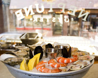
Of all businesses, restaurants are the most in need of a website with a simple hierarchical structure and with the phone number and address clearly visible to all types of devices. Yet, so many restaurant sites are created as if their sole purpose were to wow you with how smoothly the lobster bisque floats in from the left side of the page.
Restaurants depend on reservations and walk up traffic, so you could assume that their sites should be built around 4 basic needs:
- The site offer up the phone number and location first and foremost, just after the logo.
- The site be in a form visible and legible by all smartphones and tablet.
- The site be easily editable by staff nightly so that any menu changes and specials can be highlighted - keeping visitors returning.
- The site reflect the style and culture of the restaurant and be visibly pleasing to visit.
Amazingly, so many restaurants only focus on #4, to the exclusion of all the rest. Many sites have text formatted in flash so that they can use non-web-standard typefaces (see previous blog post) or even worse, they set the type all as PNG image, so that none of it is searchable. Many sites I found today have the location and telephone number set as PNG image. (!)
What causes this? Vanity? Ego? Inexperience? Perhaps a combination of all three. Many businesses don't think that although that flash animation introduction they spent $3000 on looks beautiful, and clearly articulates the culture of their establishment, it only wows the visitor 1 or 2 times, if ever. After that, the visitor becomes increasingly annoyed with your site, and, more importantly, your brand. Sites built this way are there to please the owner of the restaurant, not the customer.
What we donate to an establishment when we visit their self-promoting site, is our time. We don't like to have it wasted. What we want is information and we want it immediately. If a site can get it to us, on our mobile or at home, and keep things up to date, we will return, not only to the site, but, more likely, to the restaurant.
Below is a link to an article in the Globe by Devra First, highlighting, in a wickedly sharp manner, the pitfalls of restaurant sites.