Thoughts & Articles
Building your site from the outside in.

Jim Infantino
11November 2013
When you are considering a new website for your business, it is important to think like a visitor. What are they looking for? What do they need to know about you? What DON'T they need to know about you? As obvious as this seems, creating your site from the point of view of a potential client or customer or information gatherer is critical to the site's success.
Let's start with the navigation. Do your nav buttons speak to the world, or to your own head? Navigations tend to trend pretty bland.
home, about, products, services, blog, contact.
You can make these buttons longer:
home, about us, our products, our services, announcements, contact us.
This, however, doesn't really change the effect. Yawn. Worse is the office centric:
home, company info, product line, client services, articles & news, company directory.
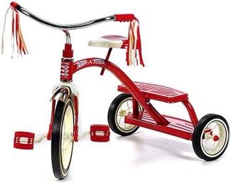
None of these really addresses what people need to know when they get to your site. What specifically are your products? What services do you offer? Who are you? Why should I care? The buttons names can be more specific and engaging. If you sell tricycles, try a nav bar that makes it clear what you sell. Specificity, if it is worded from the viewer's point of view can help clarify, and encourage your visitor to click in. Most sites have their visitors bounce right off the homepage, because they don't see anything interesting to click on. So, try losing the home button in favor of clicking on your logo,
logo, the trike team, 3 wheeled wonders, pedal repairs, trike talk, collide with us
would work for your audience, if they can stand some cute.
Beyond the navigation, think of how many points of interest are on your homepage. Do you have current and changing excerpts and images to interest people? How many opportunities to click to you give your visitor when they first arrive? Too few can cause the visitor to bounce out of boredom, and too many can cause the visitor to be unable to choose, eventually ending in the same result. This can be solved by clarification of your site. Is everything on your site geared towards a common purpose? What do you want people to do once they find it? Are there any clickable items that get them there right away, or do they have to work at it? Keeping a critical eye on your site with regards to the result you want is essential to it's success.
Regarding the actual content, do your pages make statements or ask questions? What percentage is the former, what percentage is the latter? Obviously, questions are more geared to the visitor, they can get them thinking, spark curiosity, and look! There's a button to contact / sign up / make an inquiry. Captured. If you run a site that has point of sale, questions may not be the best thing, rather building up an aura around the product might be right, but remember the visitor, write to them, think of them, try to think like them, and then write what you would like to read.
This process requires constant refinement. The more we think like someone who just found us, the more we can see our site the way others do, and help it to become more than a reflection of our vanity, but a valuable asset to our brand.
Let's start with the navigation. Do your nav buttons speak to the world, or to your own head? Navigations tend to trend pretty bland.
home, about, products, services, blog, contact.
You can make these buttons longer:
home, about us, our products, our services, announcements, contact us.
This, however, doesn't really change the effect. Yawn. Worse is the office centric:
home, company info, product line, client services, articles & news, company directory.
None of these really addresses what people need to know when they get to your site. What specifically are your products? What services do you offer? Who are you? Why should I care? The buttons names can be more specific and engaging. If you sell tricycles, try a nav bar that makes it clear what you sell. Specificity, if it is worded from the viewer's point of view can help clarify, and encourage your visitor to click in. Most sites have their visitors bounce right off the homepage, because they don't see anything interesting to click on. So, try losing the home button in favor of clicking on your logo,
logo, the trike team, 3 wheeled wonders, pedal repairs, trike talk, collide with us
would work for your audience, if they can stand some cute.
Beyond the navigation, think of how many points of interest are on your homepage. Do you have current and changing excerpts and images to interest people? How many opportunities to click to you give your visitor when they first arrive? Too few can cause the visitor to bounce out of boredom, and too many can cause the visitor to be unable to choose, eventually ending in the same result. This can be solved by clarification of your site. Is everything on your site geared towards a common purpose? What do you want people to do once they find it? Are there any clickable items that get them there right away, or do they have to work at it? Keeping a critical eye on your site with regards to the result you want is essential to it's success.
Regarding the actual content, do your pages make statements or ask questions? What percentage is the former, what percentage is the latter? Obviously, questions are more geared to the visitor, they can get them thinking, spark curiosity, and look! There's a button to contact / sign up / make an inquiry. Captured. If you run a site that has point of sale, questions may not be the best thing, rather building up an aura around the product might be right, but remember the visitor, write to them, think of them, try to think like them, and then write what you would like to read.
This process requires constant refinement. The more we think like someone who just found us, the more we can see our site the way others do, and help it to become more than a reflection of our vanity, but a valuable asset to our brand.