Thoughts & Articles
Landing Pages: Winning Designs Help Earn Conversions


Though mobile usage is on the rise, traditional websites are still a giant part of the immediate future when it comes to how users interact with businesses. Seventy-two percent of site traffic still comes from non-mobile devices, according to Monetate's Q4 2013 report, and the overall conversion rate via laptops and desktops at the end of last year was 3.11%.
Compare that to a conversion rate of 2.59% on tablets, and 1.01% via smartphones.
Not that one should underplay the significance of mobile to your business. Research suggests that visitors in some e-commerce sectors actually find merchants on multiple devices — it's just that they press buy at the end of that journey on their laptops or desktops.
Point is, these numbers tell us that a website is still a key component of your digital storefront. Optimizing your landing pages and your calls to action so that your customers can intuit, access, and acquire what you want them to — no matter how they find you — is a critical element of the design choices you make.
With that in mind, let's turn to some examples and tips for thinking about design in light of winning conversions from the customers who come to look at what you do.
Good Builds: Websites that Showcase Dot-Com Design
Part of the mission behind site design is to make the function and products of the company behind it plain to see. Another goal is to make the visitor to a given type of business feel at home. Meaning, we want to craft aesthetics that encourage them to spend some time looking around. Here are two examples of sites we've worked on — designs that combine both factors in just the right measure.
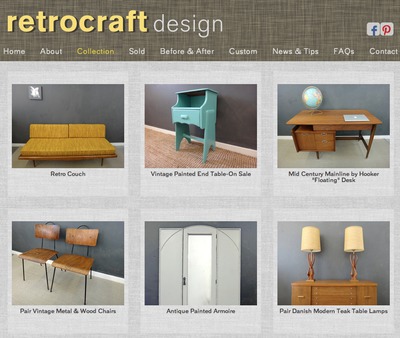
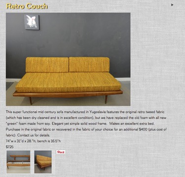
- Retrocraft: The slider draws the visitor in, offering multiple images per slide of this vintage furnishing shop's inventory, and the subscribe button is prominent from the start. Beyond capturing customer information, though, the navigation has been fine-tuned to allow shoppers to find items they like by category. Look and feel are clearly important to Retrocraft — striking visuals are part of their bread and butter. And so, painstaking attention is taken to accentuate the retro and the modern elements of their goods.
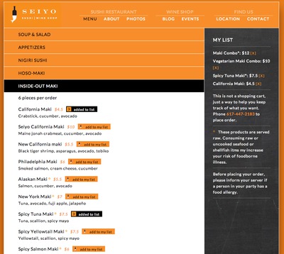
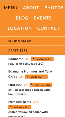
- Seiyo: Again, a slider communicates the interior and dining experience of Seiyo's sushi restaurant and wine shop, and the hours and address are easy to find. Note that the phone and address are clickable — the site is nicely mobile-enhanced in this way (more on this in the next section). The menu emphasizes action: visitors can create a list of their order, and then call in to place it directly. Aesthetics-wise, Seiyo's site was modified from earlier incarnations to draw heavily on their identity colors. And, although the site is boxed, the feel is more modern than the typical limited size of many boxed sites. It certainly fits with the idea of a bento box, which is also a central part of their offerings and brand identity.
Design Tips for Landing Pages
Ease of navigation, landing pages that lead to direct product interaction, and a visual environment that involves the visitor in the feel of the business — these are all important to how we design a site. There are some other ways to think about the process, too. What follow are some tips that any owner can consider, and ones on which most designers would agree.
- Control the scroll. Mobile environments might be spaces in which we're fine with wheeling up and down with a flick of the thumb, but laptops and desktops don't have to require us to look around like that. Yes, there's a school of thought that "above the fold" no longer means anything to mobile-savvy users, but what's the argument to introduce scrolling when you've got more real estate with which to work? Give your visitors what they're looking for in a single pane, and provide them with calls to action that ask only one click, not scrolling and searching to discover how to get to your service.
- Bigger isn't always better. The appearance of larger and larger screens in the traditional-device milieu might encourage you to ramp up your image sizes and make splashy landing-page choices for your dot-com channel. But remember that your landing page is also about SEO, and it's about minimizing the lag between arrival and customer activation. Meaning, it should say something, in words, for both the visitor and the search engine. Also, when you get to the next point in this list, those 1,200-dpx decisions could come back to haunt you.
- Traditional and mobile are linked. In the end, you can't think about dot-com and mobile channels in mutually exclusive ways. Outside an app, your mobile site and your desktop site are likely to share quite a lot of design features. Keeping your traditional-device experience confined to pleasing, prompt ways to work from landing to check-out will make your mobile presence work — and look — better as well.
Managing your business is hard enough. Managing your website should be easy. Slabmedia offers high quality, custom designed, easy to edit websites. Talk to us about building your site, one that you can update yourself with ease. E-mail us, or call us at 617.566.3433.